Profitmaster Displays · Brand StandardsIdentitySheet 06 / 34Rev A · 2026-09-25
06 · Identity · Interim
One wordmark.
The 2026 refresh of the PROFITMASTER wordmark is the only logo for new work. It keeps the oblique letterforms in use since at least 1990, drops the speed line, and sets DISPLAYS INC in a heavier weight, aligned edge to edge.
The primary logo

Interim. This wordmark is the standard until a decision on a long-term identity. It replaces every earlier arrangement, including the stacked version with the PM monogram, which is retired.
06.1
Two versions, and only two.


There is no colour version. On a customer's red or blue, use white; see Customer brands.
06.2
What changed in 2026.
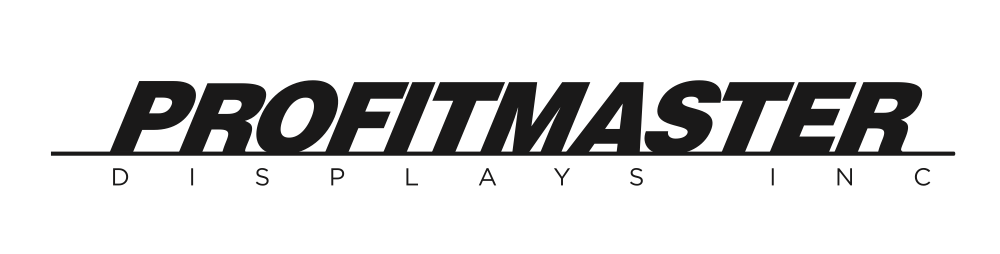
Kept
The oblique PROFITMASTER letterforms. The recognition is the asset.
Removed
The horizontal speed line, and the PM monogram. Neither holds up at small sizes.
Strengthened
DISPLAYS INC, now heavier and tracked so both lines end on the same edges.
06.3
The master file.
- Name
- PMD-Logo-Refresh-2026
- Formats
- .ai · .eps · .pdf (vector) · .png 800 / 1200 px, black and white
- Home
- CloudStation Public / _00_logos. The single source for every logo
- Type
- Outlined. No live fonts, so it cannot reflow or substitute
- Colour
- K100 black or K0 white only
- Rule
- Place from the master. Never from a website, an email or an old job file
- Logo files, black and whiteDownloads
Drawing nameLogo
SectionIdentity
Sheet06 / 34
RevA
Date2026-09-25
Drawn by · PMD Graphics